
When life is on the line

Philipe Petit’s famous high wire stunt between the Twin Towers.
Even after some experience designing products for dozens of industries (including some medical devices), I really don’t think I understood designing for usability until I started designing medical devices full-time. Designers who develop products for health care often describe a deep sense of pride in their work - a sense that what they are doing truly matters and can make a difference. A phrase I hear often is “if it isn’t designed right, someone could die,” and maybe it describes that feeling of a high-wire act that can come with the job. Maybe if all industries were designed this way we wouldn’t have progressed so quickly, or maybe we would have better products in our kitchens and living rooms. Who knows? All I know is that designing medical devices is a different breed and it requires some muscle in the usability department. I found that my design education didn’t prepare me fully for this kind of “life or death” pressure so I hit the books and started paying attention to what my Human Factors partners were telling me. I’d like to share with you some of my tools for walking the tightrope and getting to the other side of the toughest usability problems.
Going from Subjective to Objective
Sure, I think a good designer develops a feel for usability - even if they never study it formally. Looking back, I probably rode on instinct for a long time. Often with little or no access to users and user testing, I analyzed the market to get a sense of what worked and what didn’t for consumers…From a usability standpoint, sometimes launching these products felt like the way NASA launches a rocket: with intention and a whole lot of calculated rigor…but also with breath held and fingers crossed. Unlike software that can be updated, the launch of hardware is the moment of truth and you had better hope you did your homework.
One reason I think innovation in the consumer space tends to progress much more quickly than the health care space is because they both have dramatically different relationships with provocation and failure. The infamous “snake oil salesman” has been systematically addressed in the highly regulated medical industry, but is still at large in today’s tech industry. There are countless startups promising the world, and vowing to solve your problems through technology only to vaporize the next year. I have met a few designers of failed startups (including myself) who point to their beautiful industrial design and say “well, it didn’t fail because of the ID.” I can assure you no one thinks like that when they are developing a medical device - ensuring a product works, and is safe, and offers real clinical value worth the cost is not “someone else’s” job.
When it came to life or death, my gut-level instincts (which never got any quieter) hurt my argument, more then helped them in design reviews with stakeholders. I needed to purify my work through objective reasoning. How do we KNOW its right? How do we measure it? How do I design when failure isn’t an option? I started seeing the world differently, and like a musician that trains their ear, I started to view design for usability as a spectrum.
The war against “what if?”
In the beginning of working for a medical device company it felt like design critiques would inevitably wander off into the wilderness of “What ifs?” “What if the nurse thinks the button does this when it actually does that?” “What if the drape comes loose and it gets tangled up in the handle?” “What if they aren’t paying attention and knock their head into that edge?” then followed with “Maybe we could’s” “maybe we could add a label an arrow that tells them the knob actually turns?” “maybe we could make it a different color so the user can tell it’s different?”
Simply taking a “what if?” at face value and acting on it can feel precarious for the designer who is always seeking to simplify, not complicate, a product. I felt like we were painting an unfair image of the consumer, a bit like the guy above. If you start with the worst-case user and bookend it with a worst case scenario you end up with a radical and reactionary design brief. A kind of garbage-in so garbage-out scenario. Job #1 was to tease apart and analyze the “what ifs” to determine whether they should be graduated from potential problems to actual problems requiring actual solutions.
I found, while Human Factors specialists were the best at coming up with a “what if?” they were also the best, when challenged, to correctly break down analyze whether that “what if” required a “what now?” - so I started leaning on them as my go-to partners in navigating the grey zones of usability.
My formula for success.
I needed a strategy for a wide range of circumstances where errors might happen. It started by studying how people learn from their environments in the first place, which I had no formal understanding of, and that led to all sorts of new strategies for solving problems. Then, during a conversation with Human Factors specialist Shannon Clark, she suggested to me there are five approaches a designer can take to inform user behavior and get their product or service to be understandable and usable. It was brilliant, really, I had never heard of it before, and not since (though Dan Formosa has a great hierarchy list that is similiar!), but I’ve held on to Shannon’s list as a kind of “designer’s guide to guiding user behavior.” It has never let me down, and I’m happy now to share it with you.

Design solutions for usability can be grouped into these five approaches.
Less of a hierarchy and more of a spectrum
Assuming we’ve graduated beyond the “what if” stage and have identified a usability problem worth solving, I like to use this list to determine where we are on the solution scale. It isn’t unusual to start with “we could add a label, or an arrow” or “let’s put some instruction in the user manual.” Both of these approaches are friendly to the design schedule but live fairly low on the “guaranteed to work” scale. While there is no guarantee, no matter what you do, the higher you go up the list, the more of a chance you have (as the designer) to guide the end user to success. It’s fine to think of this list as a sort of convection leading upward in effectiveness, but beware not to become dogmatic about it. Each strategy on the list has it’s place, and each overlays and dovetails with the other.
Let’s start at the top, shall we?
Afford: make it obvious

“Stick em with the pointy end”
The word affordance, coined by James J. Gibson is defined quite simply as “what the environment offers the individual.” For the Industrial Designer I’ve heard this often reinterpreted as “what the object offers the individual” but keep in mind THAT is a narrow perspective. Forget whether the answer is a shape or feature, or a row of pixels and think of it as a human ability to take what is offered (whether it be physical, digital or notional) and make use of it. Affordances are strongest when the implied use is undeniable, obvious and intuitive once the sum of your design is encountered. John Snow’s advice to Arya Stark comes to mind when he hands her a sword and advises her to “Stick em with the pointy end.”
“I know which end to use” she tells him.

From the book “Thoughtless Acts” by Jane Fulton Siri. Humans take what is offered and align it with their intentions. A great design attempts to bring those things together.
When possible, this kind of intuitiveness is desirable, but resist the urge to make everything accountable to some kind of explicit cue in the design. The point of this list is not to suggest that when possible, one must link tasks and functions to features. Only that one must be able to make sense of what is offered. Like most things, these designed affordances lose their power and clarity without some plan for hierarchy and composition. A good example of what not to do for novice users, maybe, would be this cockpit design.

The Space Shuttle Columbia: There’s a button for everything.
As we move on, I’ll have other names for them, but the top four items on this list are, in their own way…affordances. So why, then, do we put Afford on top of a list of affordances? Well, because a truly great interaction model actually works. Afford strives for a kind of elegance and simplicity that feels like common sense. Afford is the distilled, drop-dead obvious solution that just feels right to users. Remember how simple “stick em with the pointy end” is? Afford is short for “make it obvious” and the more complicated your product, the harder this is to achieve. So you need other strategies, which brings us to the next item on our list.
Guard: it only works the right way

you can’t put a square peg in a round hole.
I’ll tell ya, I like guard.
Where a well-afforded design can create the illusion that there is no wrong way to do something, a well-guarded solution can ensure that the wrong way to do it was never an option. Engineers have a great term for it: Poka Yoke…well it’s actually a derivative from two japanese words: Yokeru (avoid) and Poka (mistake).
In many instances, guarded solutions are a kind of affordance strategy where a specific set of choices are offered to the user…and this makes things easier for them…but I place this lower than Afford because the experience of using a guarded solution can be a little frustrating at times. This narrowing of options to only the right options tends to have a trial and error effect on user experience, which is just less enjoyable than the more open kinds of interactions. Every tried plugging in a USB cable without having a good line of sight? How often do you get it right the first time? A good example of the difference between Afford and Guard can be seen in the difference between a traditional USB connector (Guarded) that must be inserted facing the proper way and the MagSafe adapter (Simple Affordance) which simply attaches itself in any orientation with little thought.
Sometime it isn’t the user error that is the problem, but what that error can lead to. Good design can guard against those too, freeing the user to make all the mistakes they want with no adverse affects.
The problem with Guard features? Well, they are great in a way, because they strive to take the burden of mistake making off of the end user. But they can also lead to an unintended effect where the sudden absence or failure of a guarded feature can backfire and ensure a mistake is made. Safety systems, such as those found in self driving cars, are good examples where reliance and absolution of control from the end user can lead to certain error should the system ever fail.
Alert: a two way street.
None of us live in an intuitive world, nor one that is guarded from every angle. For many of us, there are indications all around us when we’ve made a mistake and we learn from them - whether it is a friend with some thoughtful advice or an angry driver honking their horn when we run a red light. For most things, even in the O.R. its ok to make a small error so long as it isn’t safety related. It is the designer’s job to offer enough cues around the end user at the time of failure to correct their action and move forward in a procedure. For this, a smart, contextual alert can be just the right thing.
Many feedback sessions start with “maybe we could add an instruction or label on the product” - for those projects I suggest we might be able to graduate the solution to an alert of some kind. Why do I like alerts more than labels? I tend to think of them as being smarter and more helpful versions of labels - maybe like the better, well traveled and worldly versions of labels. Unlike their dumb, cave-dwelling, cro magna, “didn’t ya read the sign?” counterparts, Alerts know communication is a two way street. They know how to listen as well as speak. They know it is more helpful to deliver information and help in context, and they know there is more than one way to do that. Sight, sound, touch…even smell (ever burned something in the oven?) are tools in the alert toolbox.
A good alert can step in when the user is having a problem - like in the Model 3 example above - but they can also behave as affordances to guide behavior as it is happening.

We use alert systems for wayfinding all the time - I think of the the Drillhead tracker we designed at Carbon as an example of this.
The problem with alerts? They’re not always good at informing behavior prior to action - to prevent errors it is still best to consider guard and afford. But you can consider overlaying alerts on top of other mitigations (which is why I consider this list a spectrum, and not a ladder) to make those solutions more effective and “foolproof.” Also, with all things, people tend to ignore bleeps and bips and notifications if they are too repetitive. As with every one of these solutions, watch out that you aren’t relying too heavily on any one of them for too many things.
Label: fine if you’re ok with people not reading them.
Make no mistake, labeling is a huge part of medical device design. It’s the grease that keeps the wheels turning. It’s often the “hey, we tried” approach, and generally the last thing users pay much attention to when using your product.
But labeling is also great. Indispensable. I was grumping about having to put a label on one of my designs one day while waiting for a commuter train. No way am I going to ruin a perfectly clean design by adding arrows and words and billboards all over it. I’d rather just make it intuitive and do away with the need for words. What time does that train come again? Am I on the right platform? oh. yeah, labels actually help. And they’re fast, extensible, you can communicate incredibly complex and explicit things. A good label in the right circumstance is almost as good as having an expert right there helping your end user make sense of your product.
Another thing about labels is you can add and remove them, change them, improve them, translate them - at a relatively low cost to the product and the development time of a project. It’s no wonder labels are the “why not?” of nearly every “what if?”
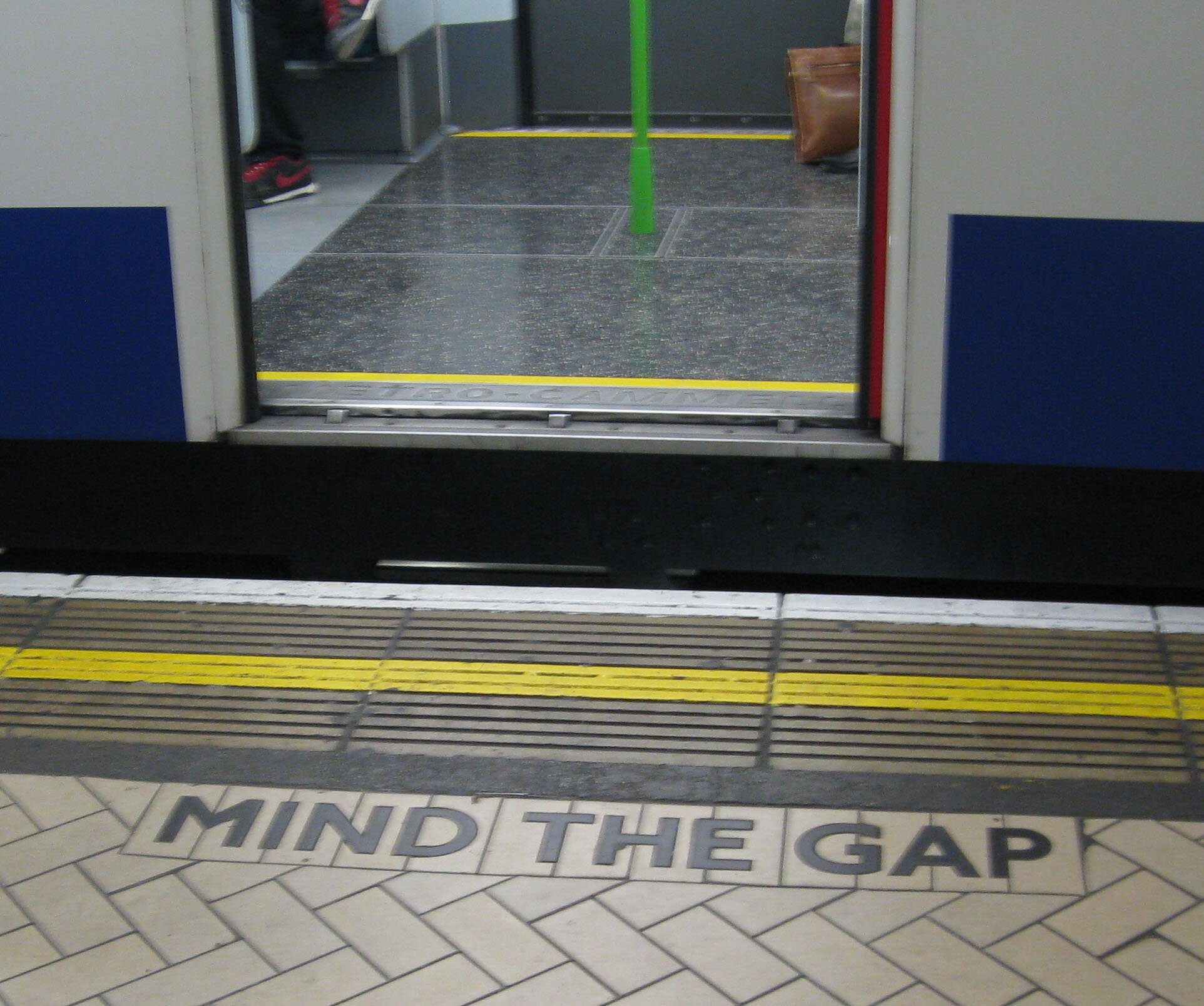
I’d say the sign on the left is incredibly useful, but the sign on the right probably isn’t. “Mind the gap” is not going to be the great revelation a person needs to avoid tripping on their way into the train car.
What is the problem with labels? Well first you have to actually notice them, and you have to be in the reading mood. For this reason, they are often a terrible way to tell someone not to do something! I’ve found, over and over, that many end users want to keep moving through their lives and this leads them to try to sort things out for themselves without stopping and looking for directions. It’s generally only after they hit a snag that they really look at what they are dealing with and scan the object for that missing clue of what to do. That is when our label saves the day - offering it’s “I told you so” to rub salt in the wound of an undiscoverable and poor design.
Adding a label to guide user behavior is fine, so long as you are ok with them failing first. I often suggest labeling to be combined with other strategies higher up on the list if safety is on the line, never the only solution to a critical usability issue.
Train: design the end user.
It’s fourth down and thirty yards. Do you go for it or punt? If you chose punt, then you’re probably a very smart coach - and you’ve probably decided that it’s just too complicated and/or risky for the project to solve your usability problem through design alone.
If you can’t get your user from point A to point B using any of the techniques above, then you do have the option of simply sitting your customer down and explaining to them, in person, how to use your product. You can show them all the cues, the consequences of doing things wrong, and teach them to memorize complex sequences and techniques. What you are doing now is designing the end user, in order to imbue them with the kind of safety mechanism and mindset required to succeed with your product.
What is the problem with training? Memory fades, and unless you can keep up the training, or your end user goes right into practice to reinforce what they learned, they will eventually be left disarmed and alone with your product anyway. Strictly from a product designer’s perspective, I’d offer that training, more than any other strategy on this spectrum, should be overlayed with other strategies and cues mentioned above - and never be used to take usability problems off of the designer’s plate.
Train your ear to know where you are in the spectrum
Looking back on it, I can point to designing medical devices full time as an education for me as a designer. A lot of people in the design profession who have the misfortune to spend a stint at the hospital as a patient walk away from that experience shocked by how outdated and generally unpleasant medical devices appear to be. In contrast to consumer world, the hospital can seem stuck in a utilitarian nightmare. Having been in it for a while now (and working for a very progressive medical device company to boot), I see exactly why “Simple and Usable” is so incredibly difficult to achieve in this highly-regulated, risk-averse space. I see just how hairy and tough the usability problems are, and how many cooks are in the kitchen. Yup, I know how the sausage is made, and its enough to turn you off of sausage forever. But I can tell you there is a heck of a lot of good design can do to bring clarity, beauty and elegance to medical devices…It is a feast. To do it, designers coming from other industries need to develop themselves and become masters of usability and design for safety. They need to earn their stripes by knowing what good design is, too, so they can bring the goodness, by while they are doing that: Train the ear, develop the palate to have a deep intrinsic knowledge of how humans think, learn and make decisions. I’m happy to share with you my logic path, and I’d love to hear what you think. I also want to invite designers out there to find their own secret to success because there are so many more out there.