
See. Know. Do.
how to avoid tunnel vision when designing for usability.
I’ve had that experience many designers can relate to where I designed something that made perfect, absolute sense to me only to watch users struggle with it in testing. You would think this happens less with experience, but it doesn’t. I used to be pretty hard on myself about it: a great design is one that everyone understands, one that everyone gets. Right is right. Now that I’m a little older, I find that silver bullet doesn’t exist. Every design requires a bit of digestion. Just like food maybe, not all tastes are the same and not all diets are compatible with all people.
It’s a mistake to think there is a product-based formula to usability. A mistake to assume that designers make products usable. It’s people who do that. Nurses, Moms, Firefighters, Stressed out celebrities and CEO’s. They figure it out, or they don’t - and how they do that is a formula concocted from a thousand factors, generally unique to that individual. While I am a huge fan of the designer using their own intuition to design, to “taste the food” as they cook, it was incredibly liberating to come to the conclusion that not all users would think as I do. It opened my eyes to the reality that I needed to offer many simultaneous paths to usability in the products I design.

OODA Loop
The subject of how people learn and interact with their world has had considerable study. I find it odd that designers have almost zero education in it - and are generally forced to offer their work to the sacrificial altar of human cognition in order to learn what works and what doesn’t.
One particularly nice model is the OODA loop (Observe, Orient, Decide, Act) which was originally developed by the military strategist John Boyd. In military operations this understanding was applied to tactics intended to disorient and confuse the enemy. Now it is applied in commercial applications and learning models - and I use a version of it when attempting to guide user behavior on products.
The gist of it, is that the human mind goes through a process in order to interact with the world. Like a computer where input and output flow together to execute a program. OODA offers us an explanation about how people think and learn: the human observes the situation, orients to what they are seeing, decides on a course of action then executes that action. Simple. In fact, I think it’s possible to combine Orient and Decide to a simple formula of See. Know. and Do just to keep things pithy.

The game Spot It! puts the OODA principle through its paces, as players compete to be the first to “Observe, Orient and Decide” when searching for matching symbols between cards.
designers play god with the details.
As designers of products we get to generate a small piece of that input we call usability cues. Typically, I find designers and human factors specialists make a common mistake of choosing one path to cognition. They choose the See. Know. Do progression for their design solution because they believe that is the best one. They believe they can imbue the product with a visual guide programmed to grab the user’s attention and guide them without fail. Even worse, many designers feel it is their purpose to embue the product with the visual character required to carefully and successfully curate and guide user behavior, and that leaves them hunting for more and more cues to add when things get tough.

Hierarchy is a powerful tool in the designer’s toolbox for organizing visual information.

Lytro Illum’s “screen kick” is a good example of a simple cue that works.
It’s great when visual cues work. It can be frustrating when they don’t. As I mentioned earlier, I see people fail all the time with prototypes I’ve designed. I see them fail because they just try stuff without looking at the product, I see them fail because they didn’t try the obvious thing and instead searched for some explicit instruction that wasn’t there. Often they fail because they are distracted, or because they’re nervous because we are watching them fail, or because we’ve given them so many awesome cues they don’t know what to look at. I see all of this failure is often an excellent teacher.
While understanding is always the goal, when appropriate (safety is another ball of wax), I don’t get hung up on the idea that a person always has to understand my product before they act. It’s not always See. Know. Do, in that order. There are many paths a human can take to achieve an understanding relationship with their product and this has implications for what details are required.
See. Know. Do
Do. See. Know. Do
Know. See. Do.
Know-See-Do. when users know more, things get simpler
When users engage a object with a deep and rich understanding of it, remarkable opportunities arise for the designer.
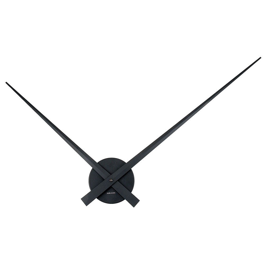
It’s 10:10….Wait, how did you know that?
In nearly everything human beings interact with from day to day the work of orientation is already mostly done. We tap into the part of the brain that interprets objects and symbols to develop common meanings and languages, and pass on those meanings to one another - Object and symbol languages are a huge part of how we construct social norms with each other. This is why, once the symbolism is learned, every clock on the planet doesn’t have to train the viewer how to read it. You see the hands and your mind invokes your understanding of the clock, you pick up the pace to get to your meeting on time. The symbolic meaning can begin to relieve the physical object of cues, creating a composition that the viewer composes and imbues themselves. This is the philosophical core of my own obsession with minimalism - the idea that objects (at their best) are open to interpretation, open to being assigned meaning and completed by the human in the moment of contact. This example of the clock is an example of how a human can approach an object with knowledge and skip the need to closely observe and interpret the object in order to interact with it. In design, there are many ways to harness this cognitive mechanism - from adopting common symbols and languages, to observing norms in placement and form. These cues march by the drum of trained behaviors - and are best friends with the designer when they enable reduced complexity (through a priori familiarity).
when users know more, things get more complicated (and that’s ok).
Another thing training and familiarity allows, beyond minimalism, is the ability to complicate an object safely and usefully. I know, that sounds terrible, right? Well, people are at their best when they put a little time into something. In fact, studies show they enjoy their products more after they’ve mastered them. So many things in our lives are are horribly complex, and are therefore hard to learn, but once we get a hang of things that complexity is super valuable. Here are some examples:

Years of practice, agony….but then self-actualization, expression. enabled by muscle memory and the endless possibilities of the instrument.

The game of Go. Millions of possible games and a guaranteed lifetime of learning.
For me, the “ah ha” moment for how familiarity can pour useful complexity into a product came from my apple watch. The more familiar I became with the interface, the more information I was comfortable having packed into that tiny screen at once. I became aware that, ironically, the interface I chose for myself was exactly the opposite of the interface I would design for someone else. It isn’t unusual to see this sort of thing, people start simple and go for the intuitive stuff at first, but slowly and over time they invite complexity and all of the added utility it can bring. That’s certainly what I did. It’s like that game of spot it above: once you get over the hard part and find the pair, it’s easy to find again. Designers can get so caught up in simplifying things to aid in those first moments of discovery, they can forget to enable certain superpowers that come along with familiarity.
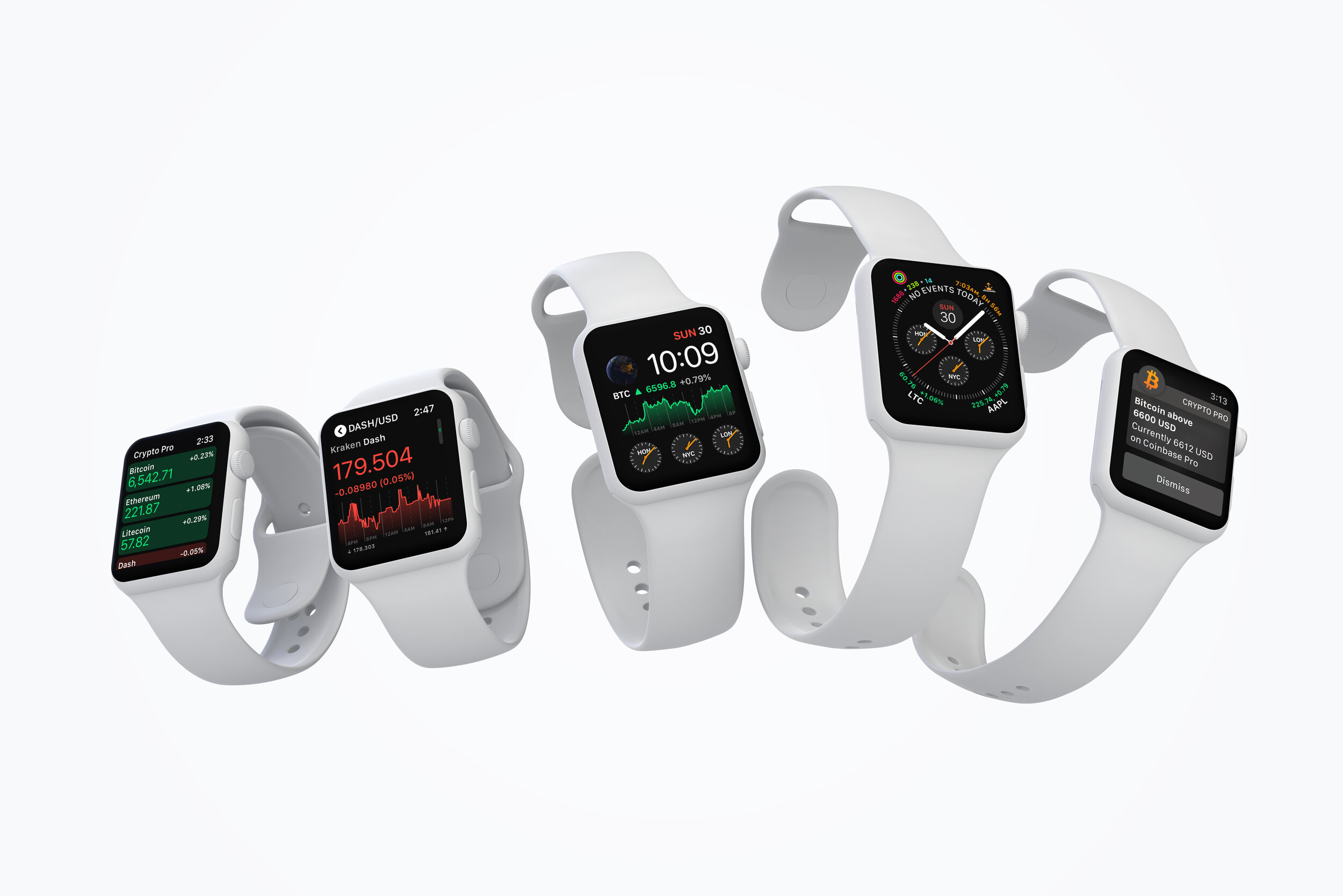
Expert vs. Novice: Over time, this is the way I set up my apple watch, and I notice others do the same. An interface that might be overwhelming at first can be simplified in the mind through familiarity.
Does all of this mean I’m a skeptic about simplicity? Not at all, I love simplicity. But only when less is…actually more. Whenever possible, I like to start by honoring what humans can bring to the interaction when navigating the essential trade offs between what should be simple and what should be complex in the products I design.
do-see-know-do: products that invite action can be great teachers.

The infamous “Norman Door” Famously referenced in Don Norman’s book “the Design of Everyday Things”
It really depends on what kind of personality you have to what degree you are like this, but people have a tendency to bias toward action and move on their first assessment of how an object should work. This assessment can come from a lot of places: maybe they used another product like it and assumes this one works the same way, maybe they read instructions, maybe they are just reacting to the shapes you are giving them. The “Norman Door” is a good example of how See-Know-Do can break down as the door handle tells us one thing (this handle is for pushing!) while the sign on the door tells us another thing. (You must pull the door to open it!). For many people the handle wins the argument and people first attempt to push the door open. For others, the sign on the door wins. It really depends on which symbol is stronger in the mind, and studies show that people often read shapes first. Really, as elegant as a handle that can afford both push and pull is, unless the door can open either way, it is confusing to put a handle like this on both sides.
While I’m a big believer that it is always best to align the visual cues and physical affordances of objects with how they are to be used, I am empowered to know that this is not the only path to success. Sometimes you don’t get the opportunity to make a product entirely intuitive and discover able the first time they use it. Maybe it’s super complicated and explicit affordances and labels start to compete with each other, maybe it’s too risky to rely on visual cues alone to guide the user (think medical equipment and heavy machinery), whatever the reason it is entirely common that the designer has to assume their product will be used “off book” and plan accordingly.
It is here where the designer can begin to consider unguided and uniformed action by the user as the first step of discovery.
Sometimes you don’t know until you try. An Intelligent product rewards exploration.
One mental framework I find incredibly useful in this digital age, is to stop thinking of objects as “dumb.”

The Caravel line of knives, spoons and Forks, designed by Henning Coppel.
Some of my favorite objects are dumb, though. This flatware set, for example are great for salads and steaks, and just about anything you want to use them for. They’ll never know the difference, feel free to use them for scraping sludge if you’d like. The designer imbued these objects with beauty and function, and they are my favorite choice for flatware….but they are dumb objects, literally stamped with utility, without any ability to adapt to me and the environment they exist in.
An intelligent object though…might know what actions you are taking with it. It might know a better way, or it might choose on it’s own to initiate the next step.
“Close Console Lid Gently”
There’s nothing particularly intuitive about the Model 3’s console lid, so its not unusual to fail utterly at closing it. The push-pop mechanism is finicky and likes to be handled in a certain way. What the mechanism lacks in smarts and versatility, the car makes up for by having a sensor at the door which initiates helpful instructions in context of the problem the user is having. Is this great design? Maybe not, but it illustrates the kind of handshake digital and physical objects can have once objects have been imbued with a certain amount of smarts. This, at least, allows the user to act without knowing, and discover the info they need along the way.
Tools in your toolbox
People don’t have one particular way of doing things, and it stands to reason that objects shouldn’t either. Investigating different starting points in the user journey - beyond the ideal of “I see, so therefore I know, so therefore I do” - is a powerful way for designers to create more robust user experiences. It can lead to exciting breakthroughs in object minimalism and digital/physical hybrid interactions as well. Finally, it can lead to products that are safer and more reliable across a broader range of users, unlocking that “it just works” experience that is so precious for mainstream markets.