If you are lucky as a designer, you get a chance to make real change in the world. Even luckier when your work makes YOU better.

If you are lucky as a designer, you get a chance to make real change in the world. Even luckier when your work makes YOU better.
The past 20 years of tech evolution has led to a remarkable reduction in physical objects - evident both in the homes and desks where we work as well as the raw physicality of the devices themselves. “Designed to Disappear” is a mantra you hear everywhere in every tech company, but are they really saying the same thing?
I used to think anyone could be a designer, now I realize it’s not for everyone. Here I explore the unique role designers play and the unique motivation and support they need from their leaders to thrive.
Don’t Eat, Buy Books. Six Staples for your Design Library
Philipe Petit’s famous high wire stunt between the Twin Towers.
Even after some experience designing products for dozens of industries (including some medical devices), I really don’t think I understood designing for usability until I started designing medical devices full-time. Designers who develop products for health care often describe a deep sense of pride in their work - a sense that what they are doing truly matters and can make a difference. A phrase I hear often is “if it isn’t designed right, someone could die,” and maybe it describes that feeling of a high-wire act that can come with the job. Maybe if all industries were designed this way we wouldn’t have progressed so quickly, or maybe we would have better products in our kitchens and living rooms. Who knows? All I know is that designing medical devices is a different breed and it requires some muscle in the usability department. I found that my design education didn’t prepare me fully for this kind of “life or death” pressure so I hit the books and started paying attention to what my Human Factors partners were telling me. I’d like to share with you some of my tools for walking the tightrope and getting to the other side of the toughest usability problems.
Sure, I think a good designer develops a feel for usability - even if they never study it formally. Looking back, I probably rode on instinct for a long time. Often with little or no access to users and user testing, I analyzed the market to get a sense of what worked and what didn’t for consumers…From a usability standpoint, sometimes launching these products felt like the way NASA launches a rocket: with intention and a whole lot of calculated rigor…but also with breath held and fingers crossed. Unlike software that can be updated, the launch of hardware is the moment of truth and you had better hope you did your homework.
One reason I think innovation in the consumer space tends to progress much more quickly than the health care space is because they both have dramatically different relationships with provocation and failure. The infamous “snake oil salesman” has been systematically addressed in the highly regulated medical industry, but is still at large in today’s tech industry. There are countless startups promising the world, and vowing to solve your problems through technology only to vaporize the next year. I have met a few designers of failed startups (including myself) who point to their beautiful industrial design and say “well, it didn’t fail because of the ID.” I can assure you no one thinks like that when they are developing a medical device - ensuring a product works, and is safe, and offers real clinical value worth the cost is not “someone else’s” job.
When it came to life or death, my gut-level instincts (which never got any quieter) hurt my argument, more then helped them in design reviews with stakeholders. I needed to purify my work through objective reasoning. How do we KNOW its right? How do we measure it? How do I design when failure isn’t an option? I started seeing the world differently, and like a musician that trains their ear, I started to view design for usability as a spectrum.
In the beginning of working for a medical device company it felt like design critiques would inevitably wander off into the wilderness of “What ifs?” “What if the nurse thinks the button does this when it actually does that?” “What if the drape comes loose and it gets tangled up in the handle?” “What if they aren’t paying attention and knock their head into that edge?” then followed with “Maybe we could’s” “maybe we could add a label an arrow that tells them the knob actually turns?” “maybe we could make it a different color so the user can tell it’s different?”
Simply taking a “what if?” at face value and acting on it can feel precarious for the designer who is always seeking to simplify, not complicate, a product. I felt like we were painting an unfair image of the consumer, a bit like the guy above. If you start with the worst-case user and bookend it with a worst case scenario you end up with a radical and reactionary design brief. A kind of garbage-in so garbage-out scenario. Job #1 was to tease apart and analyze the “what ifs” to determine whether they should be graduated from potential problems to actual problems requiring actual solutions.
I found, while Human Factors specialists were the best at coming up with a “what if?” they were also the best, when challenged, to correctly break down analyze whether that “what if” required a “what now?” - so I started leaning on them as my go-to partners in navigating the grey zones of usability.
I needed a strategy for a wide range of circumstances where errors might happen. It started by studying how people learn from their environments in the first place, which I had no formal understanding of, and that led to all sorts of new strategies for solving problems. Then, during a conversation with Human Factors specialist Shannon Clark, she suggested to me there are five approaches a designer can take to inform user behavior and get their product or service to be understandable and usable. It was brilliant, really, I had never heard of it before, and not since (though Dan Formosa has a great hierarchy list that is similiar!), but I’ve held on to Shannon’s list as a kind of “designer’s guide to guiding user behavior.” It has never let me down, and I’m happy now to share it with you.
Design solutions for usability can be grouped into these five approaches.
Assuming we’ve graduated beyond the “what if” stage and have identified a usability problem worth solving, I like to use this list to determine where we are on the solution scale. It isn’t unusual to start with “we could add a label, or an arrow” or “let’s put some instruction in the user manual.” Both of these approaches are friendly to the design schedule but live fairly low on the “guaranteed to work” scale. While there is no guarantee, no matter what you do, the higher you go up the list, the more of a chance you have (as the designer) to guide the end user to success. It’s fine to think of this list as a sort of convection leading upward in effectiveness, but beware not to become dogmatic about it. Each strategy on the list has it’s place, and each overlays and dovetails with the other.
Let’s start at the top, shall we?
“Stick em with the pointy end”
The word affordance, coined by James J. Gibson is defined quite simply as “what the environment offers the individual.” For the Industrial Designer I’ve heard this often reinterpreted as “what the object offers the individual” but keep in mind THAT is a narrow perspective. Forget whether the answer is a shape or feature, or a row of pixels and think of it as a human ability to take what is offered (whether it be physical, digital or notional) and make use of it. Affordances are strongest when the implied use is undeniable, obvious and intuitive once the sum of your design is encountered. John Snow’s advice to Arya Stark comes to mind when he hands her a sword and advises her to “Stick em with the pointy end.”
“I know which end to use” she tells him.
From the book “Thoughtless Acts” by Jane Fulton Siri. Humans take what is offered and align it with their intentions. A great design attempts to bring those things together.
When possible, this kind of intuitiveness is desirable, but resist the urge to make everything accountable to some kind of explicit cue in the design. The point of this list is not to suggest that when possible, one must link tasks and functions to features. Only that one must be able to make sense of what is offered. Like most things, these designed affordances lose their power and clarity without some plan for hierarchy and composition. A good example of what not to do for novice users, maybe, would be this cockpit design.
The Space Shuttle Columbia: There’s a button for everything.
As we move on, I’ll have other names for them, but the top four items on this list are, in their own way…affordances. So why, then, do we put Afford on top of a list of affordances? Well, because a truly great interaction model actually works. Afford strives for a kind of elegance and simplicity that feels like common sense. Afford is the distilled, drop-dead obvious solution that just feels right to users. Remember how simple “stick em with the pointy end” is? Afford is short for “make it obvious” and the more complicated your product, the harder this is to achieve. So you need other strategies, which brings us to the next item on our list.
you can’t put a square peg in a round hole.
I’ll tell ya, I like guard.
Where a well-afforded design can create the illusion that there is no wrong way to do something, a well-guarded solution can ensure that the wrong way to do it was never an option. Engineers have a great term for it: Poka Yoke…well it’s actually a derivative from two japanese words: Yokeru (avoid) and Poka (mistake).
In many instances, guarded solutions are a kind of affordance strategy where a specific set of choices are offered to the user…and this makes things easier for them…but I place this lower than Afford because the experience of using a guarded solution can be a little frustrating at times. This narrowing of options to only the right options tends to have a trial and error effect on user experience, which is just less enjoyable than the more open kinds of interactions. Every tried plugging in a USB cable without having a good line of sight? How often do you get it right the first time? A good example of the difference between Afford and Guard can be seen in the difference between a traditional USB connector (Guarded) that must be inserted facing the proper way and the MagSafe adapter (Simple Affordance) which simply attaches itself in any orientation with little thought.
Sometime it isn’t the user error that is the problem, but what that error can lead to. Good design can guard against those too, freeing the user to make all the mistakes they want with no adverse affects.
The problem with Guard features? Well, they are great in a way, because they strive to take the burden of mistake making off of the end user. But they can also lead to an unintended effect where the sudden absence or failure of a guarded feature can backfire and ensure a mistake is made. Safety systems, such as those found in self driving cars, are good examples where reliance and absolution of control from the end user can lead to certain error should the system ever fail.
None of us live in an intuitive world, nor one that is guarded from every angle. For many of us, there are indications all around us when we’ve made a mistake and we learn from them - whether it is a friend with some thoughtful advice or an angry driver honking their horn when we run a red light. For most things, even in the O.R. its ok to make a small error so long as it isn’t safety related. It is the designer’s job to offer enough cues around the end user at the time of failure to correct their action and move forward in a procedure. For this, a smart, contextual alert can be just the right thing.
Many feedback sessions start with “maybe we could add an instruction or label on the product” - for those projects I suggest we might be able to graduate the solution to an alert of some kind. Why do I like alerts more than labels? I tend to think of them as being smarter and more helpful versions of labels - maybe like the better, well traveled and worldly versions of labels. Unlike their dumb, cave-dwelling, cro magna, “didn’t ya read the sign?” counterparts, Alerts know communication is a two way street. They know how to listen as well as speak. They know it is more helpful to deliver information and help in context, and they know there is more than one way to do that. Sight, sound, touch…even smell (ever burned something in the oven?) are tools in the alert toolbox.
A good alert can step in when the user is having a problem - like in the Model 3 example above - but they can also behave as affordances to guide behavior as it is happening.
We use alert systems for wayfinding all the time - I think of the the Drillhead tracker we designed at Carbon as an example of this.
The problem with alerts? They’re not always good at informing behavior prior to action - to prevent errors it is still best to consider guard and afford. But you can consider overlaying alerts on top of other mitigations (which is why I consider this list a spectrum, and not a ladder) to make those solutions more effective and “foolproof.” Also, with all things, people tend to ignore bleeps and bips and notifications if they are too repetitive. As with every one of these solutions, watch out that you aren’t relying too heavily on any one of them for too many things.
Make no mistake, labeling is a huge part of medical device design. It’s the grease that keeps the wheels turning. It’s often the “hey, we tried” approach, and generally the last thing users pay much attention to when using your product.
But labeling is also great. Indispensable. I was grumping about having to put a label on one of my designs one day while waiting for a commuter train. No way am I going to ruin a perfectly clean design by adding arrows and words and billboards all over it. I’d rather just make it intuitive and do away with the need for words. What time does that train come again? Am I on the right platform? oh. yeah, labels actually help. And they’re fast, extensible, you can communicate incredibly complex and explicit things. A good label in the right circumstance is almost as good as having an expert right there helping your end user make sense of your product.
Another thing about labels is you can add and remove them, change them, improve them, translate them - at a relatively low cost to the product and the development time of a project. It’s no wonder labels are the “why not?” of nearly every “what if?”
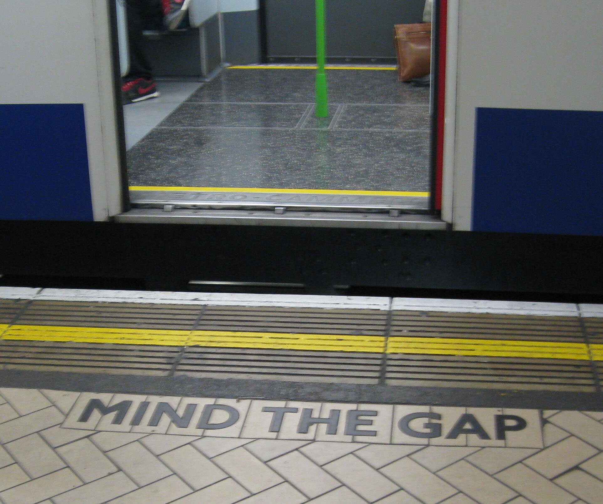
I’d say the sign on the left is incredibly useful, but the sign on the right probably isn’t. “Mind the gap” is not going to be the great revelation a person needs to avoid tripping on their way into the train car.
What is the problem with labels? Well first you have to actually notice them, and you have to be in the reading mood. For this reason, they are often a terrible way to tell someone not to do something! I’ve found, over and over, that many end users want to keep moving through their lives and this leads them to try to sort things out for themselves without stopping and looking for directions. It’s generally only after they hit a snag that they really look at what they are dealing with and scan the object for that missing clue of what to do. That is when our label saves the day - offering it’s “I told you so” to rub salt in the wound of an undiscoverable and poor design.
Adding a label to guide user behavior is fine, so long as you are ok with them failing first. I often suggest labeling to be combined with other strategies higher up on the list if safety is on the line, never the only solution to a critical usability issue.
It’s fourth down and thirty yards. Do you go for it or punt? If you chose punt, then you’re probably a very smart coach - and you’ve probably decided that it’s just too complicated and/or risky for the project to solve your usability problem through design alone.
If you can’t get your user from point A to point B using any of the techniques above, then you do have the option of simply sitting your customer down and explaining to them, in person, how to use your product. You can show them all the cues, the consequences of doing things wrong, and teach them to memorize complex sequences and techniques. What you are doing now is designing the end user, in order to imbue them with the kind of safety mechanism and mindset required to succeed with your product.
What is the problem with training? Memory fades, and unless you can keep up the training, or your end user goes right into practice to reinforce what they learned, they will eventually be left disarmed and alone with your product anyway. Strictly from a product designer’s perspective, I’d offer that training, more than any other strategy on this spectrum, should be overlayed with other strategies and cues mentioned above - and never be used to take usability problems off of the designer’s plate.
Looking back on it, I can point to designing medical devices full time as an education for me as a designer. A lot of people in the design profession who have the misfortune to spend a stint at the hospital as a patient walk away from that experience shocked by how outdated and generally unpleasant medical devices appear to be. In contrast to consumer world, the hospital can seem stuck in a utilitarian nightmare. Having been in it for a while now (and working for a very progressive medical device company to boot), I see exactly why “Simple and Usable” is so incredibly difficult to achieve in this highly-regulated, risk-averse space. I see just how hairy and tough the usability problems are, and how many cooks are in the kitchen. Yup, I know how the sausage is made, and its enough to turn you off of sausage forever. But I can tell you there is a heck of a lot of good design can do to bring clarity, beauty and elegance to medical devices…It is a feast. To do it, designers coming from other industries need to develop themselves and become masters of usability and design for safety. They need to earn their stripes by knowing what good design is, too, so they can bring the goodness, by while they are doing that: Train the ear, develop the palate to have a deep intrinsic knowledge of how humans think, learn and make decisions. I’m happy to share with you my logic path, and I’d love to hear what you think. I also want to invite designers out there to find their own secret to success because there are so many more out there.
I’ve had that experience many designers can relate to where I designed something that made perfect, absolute sense to me only to watch users struggle with it in testing. You would think this happens less with experience, but it doesn’t. I used to be pretty hard on myself about it: a great design is one that everyone understands, one that everyone gets. Right is right. Now that I’m a little older, I find that silver bullet doesn’t exist. Every design requires a bit of digestion. Just like food maybe, not all tastes are the same and not all diets are compatible with all people.
It’s a mistake to think there is a product-based formula to usability. A mistake to assume that designers make products usable. It’s people who do that. Nurses, Moms, Firefighters, Stressed out celebrities and CEO’s. They figure it out, or they don’t - and how they do that is a formula concocted from a thousand factors, generally unique to that individual. While I am a huge fan of the designer using their own intuition to design, to “taste the food” as they cook, it was incredibly liberating to come to the conclusion that not all users would think as I do. It opened my eyes to the reality that I needed to offer many simultaneous paths to usability in the products I design.
The subject of how people learn and interact with their world has had considerable study. I find it odd that designers have almost zero education in it - and are generally forced to offer their work to the sacrificial altar of human cognition in order to learn what works and what doesn’t.
One particularly nice model is the OODA loop (Observe, Orient, Decide, Act) which was originally developed by the military strategist John Boyd. In military operations this understanding was applied to tactics intended to disorient and confuse the enemy. Now it is applied in commercial applications and learning models - and I use a version of it when attempting to guide user behavior on products.
The gist of it, is that the human mind goes through a process in order to interact with the world. Like a computer where input and output flow together to execute a program. OODA offers us an explanation about how people think and learn: the human observes the situation, orients to what they are seeing, decides on a course of action then executes that action. Simple. In fact, I think it’s possible to combine Orient and Decide to a simple formula of See. Know. and Do just to keep things pithy.
The game Spot It! puts the OODA principle through its paces, as players compete to be the first to “Observe, Orient and Decide” when searching for matching symbols between cards.
As designers of products we get to generate a small piece of that input we call usability cues. Typically, I find designers and human factors specialists make a common mistake of choosing one path to cognition. They choose the See. Know. Do progression for their design solution because they believe that is the best one. They believe they can imbue the product with a visual guide programmed to grab the user’s attention and guide them without fail. Even worse, many designers feel it is their purpose to embue the product with the visual character required to carefully and successfully curate and guide user behavior, and that leaves them hunting for more and more cues to add when things get tough.
Hierarchy is a powerful tool in the designer’s toolbox for organizing visual information.
Lytro Illum’s “screen kick” is a good example of a simple cue that works.
It’s great when visual cues work. It can be frustrating when they don’t. As I mentioned earlier, I see people fail all the time with prototypes I’ve designed. I see them fail because they just try stuff without looking at the product, I see them fail because they didn’t try the obvious thing and instead searched for some explicit instruction that wasn’t there. Often they fail because they are distracted, or because they’re nervous because we are watching them fail, or because we’ve given them so many awesome cues they don’t know what to look at. I see all of this failure is often an excellent teacher.
While understanding is always the goal, when appropriate (safety is another ball of wax), I don’t get hung up on the idea that a person always has to understand my product before they act. It’s not always See. Know. Do, in that order. There are many paths a human can take to achieve an understanding relationship with their product and this has implications for what details are required.
See. Know. Do
Do. See. Know. Do
Know. See. Do.
When users engage a object with a deep and rich understanding of it, remarkable opportunities arise for the designer.
It’s 10:10….Wait, how did you know that?
In nearly everything human beings interact with from day to day the work of orientation is already mostly done. We tap into the part of the brain that interprets objects and symbols to develop common meanings and languages, and pass on those meanings to one another - Object and symbol languages are a huge part of how we construct social norms with each other. This is why, once the symbolism is learned, every clock on the planet doesn’t have to train the viewer how to read it. You see the hands and your mind invokes your understanding of the clock, you pick up the pace to get to your meeting on time. The symbolic meaning can begin to relieve the physical object of cues, creating a composition that the viewer composes and imbues themselves. This is the philosophical core of my own obsession with minimalism - the idea that objects (at their best) are open to interpretation, open to being assigned meaning and completed by the human in the moment of contact. This example of the clock is an example of how a human can approach an object with knowledge and skip the need to closely observe and interpret the object in order to interact with it. In design, there are many ways to harness this cognitive mechanism - from adopting common symbols and languages, to observing norms in placement and form. These cues march by the drum of trained behaviors - and are best friends with the designer when they enable reduced complexity (through a priori familiarity).
Another thing training and familiarity allows, beyond minimalism, is the ability to complicate an object safely and usefully. I know, that sounds terrible, right? Well, people are at their best when they put a little time into something. In fact, studies show they enjoy their products more after they’ve mastered them. So many things in our lives are are horribly complex, and are therefore hard to learn, but once we get a hang of things that complexity is super valuable. Here are some examples:
Years of practice, agony….but then self-actualization, expression. enabled by muscle memory and the endless possibilities of the instrument.
The game of Go. Millions of possible games and a guaranteed lifetime of learning.
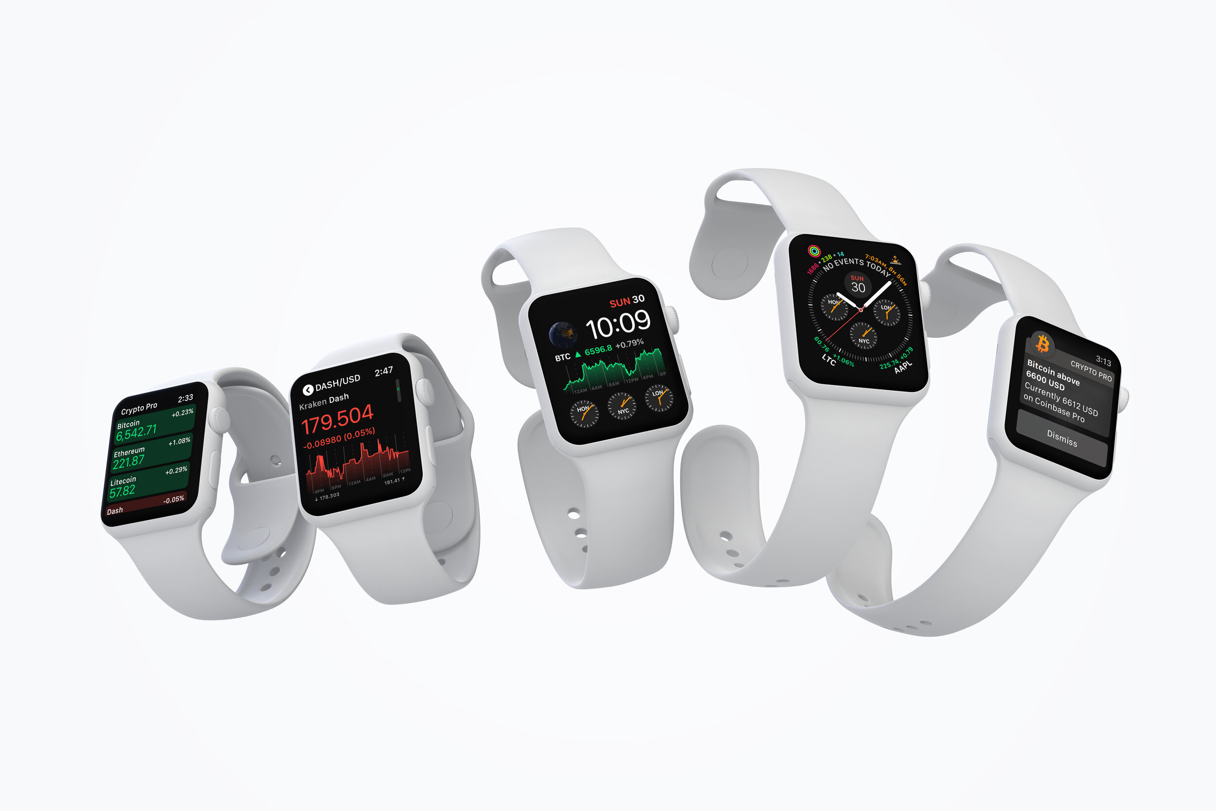
For me, the “ah ha” moment for how familiarity can pour useful complexity into a product came from my apple watch. The more familiar I became with the interface, the more information I was comfortable having packed into that tiny screen at once. I became aware that, ironically, the interface I chose for myself was exactly the opposite of the interface I would design for someone else. It isn’t unusual to see this sort of thing, people start simple and go for the intuitive stuff at first, but slowly and over time they invite complexity and all of the added utility it can bring. That’s certainly what I did. It’s like that game of spot it above: once you get over the hard part and find the pair, it’s easy to find again. Designers can get so caught up in simplifying things to aid in those first moments of discovery, they can forget to enable certain superpowers that come along with familiarity.
Expert vs. Novice: Over time, this is the way I set up my apple watch, and I notice others do the same. An interface that might be overwhelming at first can be simplified in the mind through familiarity.
Does all of this mean I’m a skeptic about simplicity? Not at all, I love simplicity. But only when less is…actually more. Whenever possible, I like to start by honoring what humans can bring to the interaction when navigating the essential trade offs between what should be simple and what should be complex in the products I design.
The infamous “Norman Door” Famously referenced in Don Norman’s book “the Design of Everyday Things”
It really depends on what kind of personality you have to what degree you are like this, but people have a tendency to bias toward action and move on their first assessment of how an object should work. This assessment can come from a lot of places: maybe they used another product like it and assumes this one works the same way, maybe they read instructions, maybe they are just reacting to the shapes you are giving them. The “Norman Door” is a good example of how See-Know-Do can break down as the door handle tells us one thing (this handle is for pushing!) while the sign on the door tells us another thing. (You must pull the door to open it!). For many people the handle wins the argument and people first attempt to push the door open. For others, the sign on the door wins. It really depends on which symbol is stronger in the mind, and studies show that people often read shapes first. Really, as elegant as a handle that can afford both push and pull is, unless the door can open either way, it is confusing to put a handle like this on both sides.
While I’m a big believer that it is always best to align the visual cues and physical affordances of objects with how they are to be used, I am empowered to know that this is not the only path to success. Sometimes you don’t get the opportunity to make a product entirely intuitive and discover able the first time they use it. Maybe it’s super complicated and explicit affordances and labels start to compete with each other, maybe it’s too risky to rely on visual cues alone to guide the user (think medical equipment and heavy machinery), whatever the reason it is entirely common that the designer has to assume their product will be used “off book” and plan accordingly.
It is here where the designer can begin to consider unguided and uniformed action by the user as the first step of discovery.
Sometimes you don’t know until you try. An Intelligent product rewards exploration.
One mental framework I find incredibly useful in this digital age, is to stop thinking of objects as “dumb.”
The Caravel line of knives, spoons and Forks, designed by Henning Coppel.
Some of my favorite objects are dumb, though. This flatware set, for example are great for salads and steaks, and just about anything you want to use them for. They’ll never know the difference, feel free to use them for scraping sludge if you’d like. The designer imbued these objects with beauty and function, and they are my favorite choice for flatware….but they are dumb objects, literally stamped with utility, without any ability to adapt to me and the environment they exist in.
An intelligent object though…might know what actions you are taking with it. It might know a better way, or it might choose on it’s own to initiate the next step.
“Close Console Lid Gently”
There’s nothing particularly intuitive about the Model 3’s console lid, so its not unusual to fail utterly at closing it. The push-pop mechanism is finicky and likes to be handled in a certain way. What the mechanism lacks in smarts and versatility, the car makes up for by having a sensor at the door which initiates helpful instructions in context of the problem the user is having. Is this great design? Maybe not, but it illustrates the kind of handshake digital and physical objects can have once objects have been imbued with a certain amount of smarts. This, at least, allows the user to act without knowing, and discover the info they need along the way.
People don’t have one particular way of doing things, and it stands to reason that objects shouldn’t either. Investigating different starting points in the user journey - beyond the ideal of “I see, so therefore I know, so therefore I do” - is a powerful way for designers to create more robust user experiences. It can lead to exciting breakthroughs in object minimalism and digital/physical hybrid interactions as well. Finally, it can lead to products that are safer and more reliable across a broader range of users, unlocking that “it just works” experience that is so precious for mainstream markets.
Above is a series of photographs of "Frames" an art installation by Andrew Kim - who also happens to be the man behind minimally minimal, a fantastically on-point blog and concept portfolio I would highly recommend checking out if you are looking for a bit of insight and inspiration. Kim's "frames" reveal to us the power the frame can have by contextualizing and organizing content. Frames isolate and deliver at the same time.
...it seems only right that cars should begin driving themselves and we can go back to watching the television of coastlines and highways that exist between our homes and our workplaces.
Starting with Kim's "Frames" is a great way to begin today's blog….It is a blog about the omnipresence of the frame in our lives. Andrew Kim has done us the favor of being very literal about it - simplifying the message in a way only artistic expression can and should. But there are many other examples of a growing discussions around the role of frames in how we experience our modern lives. There is a great quote from Robert Pirsig, author of "Zen and the Art of Motorcycle Maintenance" about why he travels on a motorcycle (and also why he doesn't wear a helmet):
"You see things vacationing on a motorcycle in a way that is completely different from any other.
In a car you're always in a compartment, and because you're used to it, you don't realize that through that car window everything you see is just more TV. You're a passive observer and it is all moving by you boringly in a frame."
What a brilliant observation - the act of driving truly is so close to a passive activity...it seems only right that cars should begin driving themselves and we can go back to watching the television of coastlines and highways that exist between our homes and our workplaces. Whether we are gazing through windows, walking through rectangular doorways, watching our televisions or recognizing our reflections in framed mirrors - it seems that life begins and ends at the end of a tunnel but repeatedly until death we pass from one frame into the next. It isn't architecture or automobiles I wanted to talk about today, though. It is technology and the content of our digital lives.
A couple of this year's hottest digital frames. Add these to human beings and you get....this:
It is unfortunate that "checking in" to your facebook requires a certain degree of "checking out"
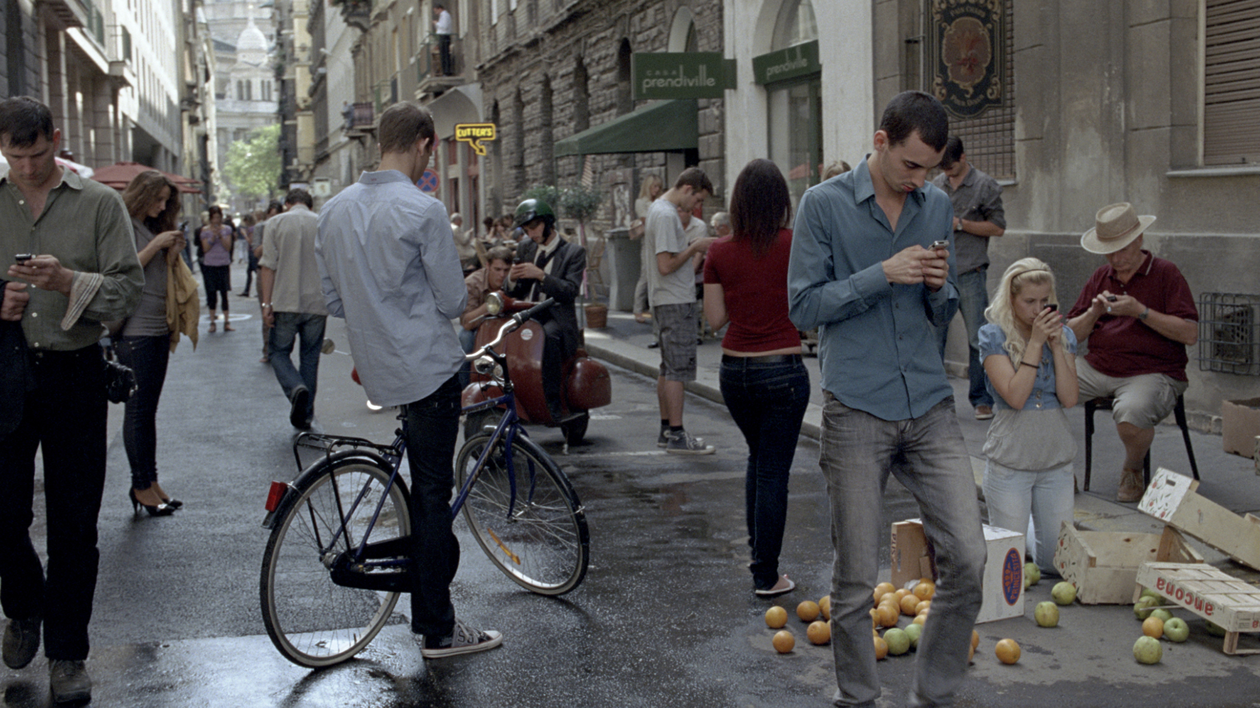
Above is a series from the Microsoft Windows Phone ad campaign "Be Here Now." It aptly refers the way digital devices pull us away from "real world' experiences and deeper into the tiny rectangular universe of Facebook, Twitter and YouTube. I love the truth in the campaign, but I think it is a bit inauthentic of Microsoft to make the claim that somehow a windows phone will free you from the frame-centric, somnambulant, zombie-state which comes along with the territory of channeling all of that digital goodness through a 4 inch display. They have made some improvements to how quickly you can get in and out of certain features like photo-taking, status checking and internet searching, but in the end these tiny rectangular objects are still standing between us and the full attention those around us (who aren't checking their own smartphones) deserve. I think this is an increasingly sore spot for a society deep in the process of the digital revolution...the idea that technology is somehow forcing us to "tune in and check out."
It is hard to feel a sore spot without dreaming of relief. It is unfortunate that "checking in" to your facebook requires a certain degree of "checking out" - or at the very least, holding a screen between you and the faces of those around you...touching a screen and not a fork, or a hand, or the steering wheel of your car. I believe that technology and design will soon relieve us of this problem, and it is one prediction one cannot help but expect to come true because it stems from a need so deep and so essential in all of us: the need to connect. While our digital interactions do offer a means of connection, it is an imperfect and deeply flawed way to interact with the world. There are already many signs that the separation between digital experiences and "real" ones will eventually disappear. The first, most essential step in this process will be the dissolution of the screen.
I have been interested in transparent display technology for a while now. Nearly every time I bring it up, I get asked the question: "yeah, but what is it good for?" I get asked this question by everyone, especially those who are currently manufacturing transparent display technology (LG, Samsung, AUO to name a few). They are right to ask this, especially because right now there are very few usage models which are at all developed enough to take advantage of a transparent screen (augmented reality is a common answer). My answer is simply this: Connection. The ability to connect with something or someone on the other side of a display could be exceptionally powerful.
Let's start with this most basic application. Above is the Loewe "Invisio" transparent TV concept by designer Michael Friebe. There is nothing more disruptive in my home than the somber presence of my 42" flatscreen TV. When I am not using it (most of the time), it just sits there, absorbing light, sucking the air out of the room. All of the furniture faces it, nothing surrounds it - the room feels unused when the TV is off - and in this way, it is as if the TV is insisting to be used, to be turned on and no longer be the inactive center of attention. Invisio is an obvious improvement to that problem. The TV retreats from focus when it is turned off, and becomes a window into the environment of the home, not a monolith to the act of watching television.
Another interesting area I think about from time to time is the concept of two-way computing. This is a bit of a challenging concept, but it is built on the idea that we could benefit from broadcasting digital information into our environment in a way that this information can be interacted with and delivered back to us. Above is a clip from "The Future of Screen Technology" - a video created by The Astonishing Tribe, a group of UI engineers and designers recently acquired by RIM/Blackberry. It's interesting to see transparent technology facilitate a new interaction in this way.
The next application is a bit more complex, but relates to the uses that most often come to mind when thinking about transparent display technology: the ability to overlay digital information over our environment by using the display as a sort of digital lens. Shown above is a Microsoft 2019 vision concept which shows a person using a tablet along with an augmented reality program to identify and call up information about the Blue Sage plant. Check out the opaque hand-grip on the side - not much more footprint than a smartphone, don't you think? I could see a whole PC architecture going in there 7 years from now, no prob.
Google's "Project Glass" is another example of the "digital lens" which eliminates the need for touch controls and instead strives to integrate computing very deeply into our personas and daily interactions. The topic of wearable computing tends to spark deep conversations between my colleagues with words like "cyborg" and "cybergeek" popping up here and there. It isn't surprising, because a product like this starts to come very close to digital augmentation - to the grafting of our digital life onto our real-world lives and identities.
Going transparent turns our displays into a two-way street, rather than the attention sucking "black holes" they are today...and this is a strong step toward pulling us back out of the swamp of digital life and back into the world we actually live in. It is a strong step toward relieving the strain digital devices currently place on our relationships. It's not the only way to do it, though.
Above is a still from Frog Design's "Future 2020" concept video. It is filled with examples of how digital information can overlay and inform our environment. The key here is that the role of "devices" is greatly diminished, and it is the information itself which takes center stage in the interactions.
Here is another clip from Pranav Mistry's "Sixth Sense" device which overlays digital interactions over analog objects and landmarks...essentially linking them to the digital world through the application of both projection (output) and gesture sensing (input). Below is an example of how a device like this can turn any object into...any other object...simply by overlaying a new digital function.
All of this is interesting when it comes to taking digital information and applying it to the world we live in....a sort of insertion or overlay of the digital world. But a third, most interesting possibility is the act of integration of the digital world into the physical one. I'm talking about digital objects, not devices.
Zero N is a computer controlled environment in which objects sense and interact with whatever exists inside of it - digitally operated or not. It is a digitally aware world, with certain laws (in this case a magnetic field which creates the levitation and locomotion of this metal ball), and certain conditions (such as lighting, temperature, etc). Imagine a world where physical objects responded by gesture, by command or even by thought. In this case, the digital realm is a way of communicating intent to the physical one, and the act of interacting with it feels more like living in a world without boundaries than it feels like sitting in front of a TV screen.
Above is the "Radio Ball" a digital object created by a friend of mine, Benoit Collette. It takes the fairly complex interaction of programming and selecting a radio station and turns it into a simple and delightful physical interaction through the combination of a radio tuner and an accelerometer sensor. Each facet or "cell" contains the coordinates for a radio channel. Explore the available channels by twisting and turning the ball, once you find one you like (the top cell is the selector) simply write the station on the cell facing up and set the ball down for some easy listening.
Sometimes I look around me and I am struck with a sense of...I don't know...a sense of living in the past. When I look at an old photograph and see horses and carriages in the streets, or pocketwatches in pockets, or really any other sort of obsolete technology, I am struck by the contrast between that era and mine. Sometimes, though, I feel like I am struck by the contrast between my era and one that has yet to exist. I often feel this way when I look at a skyline bisected by powerlines, or when I see miles of backed up traffic...I often feel this way when I see people absorbed in their smartphone and tablet screens at restaurants and bus stations. We ARE living in the past, but so has everyone who has ever existed. We are lucky to observe progress in our lifetimes, and with the aid of technology, we are set to observe the greatest leaps of progress we have ever experienced. So far we have spent the last 60 or 70 years climbing deeper and deeper into our TV sets and computer screens, I believe the coming decade will watch us as we climb out of these boxes and look around for the first time in a very long time. I am extremely enthusiastic of what the contrast between those two eras will look like.
“As man advances in civilization, and small tribes are united into larger communities, the simplest reason would tell each individual that he ought to extend his social instincts and sympathies to all members of the same nation, though personally unknown to him. This point being once reached, there is only an artificial barrier to prevent his sympathies extending to the men of all nations and races.”
I was reminded of that quote a month ago while I was listening to "Philosophy Talk" on NPR. For those of you who don't know, Philosophy Talk is a program hosted by two Stanford philosophy professors who take on a key topic, then discuss various questions asked of them on that topic by callers and members of the audience. One such question was this: "Considering all of the scientific proof and indications that global warming is threatening the future of our species, how is it that we are too stupid to change our habits and behaviors?"
The thought came to me that we may not have been lacking the ability to think globally all these millions of years, what we have lacked...right up until the last 15-20 years, were the TOOLS to develop a global awareness.
One of the hosts came back with a wonderful answer which I will paraphrase: "If you look at it, global warming is a Global Problem due to complex systems and forces happening all over the world...but for the past millions of years, we have evolved to see the guy in front of us, not to see the world in its totality." He suggested that it might be a bit unnatural for us to internalize and adopt a sense of peril related to something only visible from outer space, from a recently published scientific journal, or from that complicated emotional realm of the "personally unknown."
I made a point of putting "personally unknown" in there because I think that is the root of what Darwin was going for in the quote at the top of the page. Big D was often vocal about how ruthless and cruel the natural world was - filled with self-interest and the struggle for survival. However, Darwin was also vocal about how he clearly believed that humanity possessed a very remarkable ability to love - to empathize and to extend itself beyond the limits of individualism. You could say that the PT host was just trying to explain that you can't turn around millions of years of evolution overnight, but Darwin believed that we had ALREADY evolved into a species capable of having true connections outside of the physical boundaries of our immediate lives.
I'll tell you right now, I'm on Darwin's side on this one. I don't think we are lacking in our capacity to process and solve this global problem, the lack is elsewhere. As an industrial designer, I am constantly trying to understand the various effects products have on our lives. The thought came to me that we may not have been lacking the ability to think globally all these millions of years, what we have lacked...right up until the last 15-20 years, were the TOOLS to develop a global awareness. And that is this relationship between our evolved ability to "think global" and the rapidly increasing set of tools in our toolbox I wanted to talk about today.
Above is a heavily stylized visual representation of the Facebook network. As you can see some continents are very bright (highly facebook-ified) and some are very dark with only a few facebookified areas. When I look at this map, I am reminded of a study called "The Geography of Twitter" from the University of Toronto which tracked the tweets and twittered relationships of 50,000 subjects. From there they identified 2,000 "dyadic tweeters" or pairs of tweeters who frequently interact. What they found was that these relationships weren't occurring independently of geography, but rather very much in sync with the dominant domestic airline routes in the country. It seems the extent of an individual's ability to conveniently travel seems to have a correlation to how far their primary digital social network extends. I find this a wonderful correlation between two powerful, awareness-growing tools: Jet Planes (convenient travel) and Digital Social Networking (the ability to connect and both actively and passively monitor the activities of friends and acquaintances). By the way, if you look closely at the map above, you can see (ghosted in the white glow of high-volume facebook traffic) the outline of the I-5 corridor which runs down most of the US west coast.
We put a meaningful percentage of our consciousness into this place where identity is more of an idea than it is a fact...
The shot above is from the movie "Until the End of the World." This is a scene in which a machine is introduced which can record and play back your dreams. As the protagonists await the cataclysmic arrival of a nuclear satellite somewhere deep in the Australian bush, one of them becomes addicted to this machine. She begins spending nearly all of her time resting in the darkness, living and re-living her dreams. She is finally rescued from this addiction by a character in the film who pulls her back to reality by reciting from a novel...he saves her with words. This, in my mind, symbolizes a deep emotional battle people are fighting every day regarding the role of technology in their lives...and I'll get deeper into where that battle may be headed in the short term in another post. For now, though, people of my generation and younger (especially younger) also spend a lot of time now moving in an out of an abstract digital world - often at the cost of some engagement with our "real world" lives and relationships. Why do we do it? Well, clearly we are getting something vaguely equivalent to the sort of social interaction we crave as human beings from this digital media. Many attribute this as a new form of escapism brought on by technology, and others would say it is evidence of a new "fractured self." But the idea of a fractured self is not a new one.
If you talk to an astrologer, they will tell you that your existence on Earth is subject to three primary influences: The Sun, which is the most powerful influence, is connected to your greater nature. The Moon, second most powerful, is the influence of your inner self, or the person you feel yourself to be. And the Ascendent, or rising sign, is the influence of your external self, or how you are perceived by others. I believe that the realm of digital media and social networks is the realm where our internal and external selves are set loose to play. It is here that we unload how we wish to be perceived, and here where we receive feedback from others on a daily basis. We put a meaningful percentage of our consciousness into this place where identity is more of an idea than it is a fact...every day and with each generation that percentage grows. This, to me, is the proof that we do not just merely see "what is in front of us" - in fact, as internet use grows, and the devices we use to access it become more ubiquitous, it seems we see less and less of what is in front of us.
So, we are not just capable, but apt to lose ourselves in an abstract world once we are given the tools to do so. You would think that would bother me, but it doesn't. I think this is just the sort of attribute a species requires in order to develop a healthy global awareness.
Above is a photograph of a whale taken by Chris Jordan. Well, actually it is a photograph of 50,000 plastic trash bags which have been gathered and composed into the shape of a whale.
As the pace of our consumption has grown, our grip on our own individual part has been missing.
Much of Chris Jordan's work is centered on the idea of taking massive numbers of individual objects and gathering them together in such a way that they take on a greater, more significant form. It is no surprise that his subject matter is consistently centered on environmental issues
That's pretty much what Darwin was talking about, wasn't it? And the guy on Philosophy Talk? The latter says we have evolved to see the bags, but we have yet to see the whale...and Darwin suggests that we, out of all of the species on Earth are the only ones who can see the whale for what it is - see the forest from the trees to borrow from another metaphor. Darwin believed the universe was a dark and savage place and yet he also believed in humanity (though he was a bit late to include ALL humans in this class). As I mentioned before, he believed humans were the only species on Earth capable of broad empathy, capable of a love of all creatures, and the only species which possesses an inherent ability to rationally extend our sympathies beyond the borders of our communities, Nations and Continents. He believed that, like physicality, social instincts could also evolve according to adaptation to environmental conditions.
As the pace of our consumption has grown, our grip on our own individual part has been missing. How many coffee cups have you used this year? Toilet paper rolls? How many gallons of water? How much money have you spent on cigarettes, or clothes, or songs in your library? Modern-day consumption is very much an "in the now" sort of thing and it is easy for these items to slip away into a wash of anonymous moment lost.
All of these items, moments and facts can become blurry to remember for most, but not all. There is a new trend, enabled by our digital devices, which is greatly intriguing some of my Intel colleagues. It is called the "Quantified Self" - or the act of using technology to track oneself over long periods of time.
Here is an infographic created by Nicholas Felton, co-creator of a self tracking application daytum. For several years he has been tracking everyday interactions and gathering them into reports which he then posts online for everyone to see. These reports have detailed information in them ranging from the number of times he took a taxi (and the average distance of all taxi trips next to the longest and shortest trip), to how many milligrams of caffeine he ingested throughout the year, each month, each day. This may seem a bit extreme, but wait a minute....how many of YOU use self tracking software every day? Check out this list for some tips on where to find top-notch quantified self software - I'll bet you will recognize a few of them (I'm a huge fan of Mint.com, BTW).
If you are looking for something slightly less digital, check out the image below:
This is a project which comes from Fernd Van Engelen, a friend and former boss of mine who now heads up the ID team at Artefact. Called 999 bottles, this is a re-usable steel water bottle, that helps you keep track of your steadily shrinking eco footprint as you defer water consumption from wasteful, non-biodegradable plastic containers to one simple but beautiful container. The object becomes more interesting over time as the process of counting and keeping track begins delivering it's own value...Artefact's specialty lies in combining the digital and the physical, so the project wouldn't have been complete without an accompanying online resource which can take your tallies and put them in a broader context: "Saved 226 bottles? That's equivalent to 10 gallons of oil, which is enough to drive 500 miles." The lesson here is that a series of small decisions can scale to have greater consequences - an ideal message for developing global awareness.
I believe the tools and behaviors associated with the quantified self are another example of new tools we are using to develop a broader awareness than what our run-of-the mill everyday existence allows us. They, like the Jet Plane, like Digital Social Networking, like our ever present digital butler buddies (Smartphones), like so many new tools we have allow us to extend our awareness beyond ourselves. It used to be that our eyes and ears and hands were sufficient to change our world. Now, entire nations are vehicles of change, and it is only a collective effort that can make a difference. The tools which link individual action to collective needs have been developing and evolving since the beginning of the industrial age - take the telegraph, the locomotive, the radio, the television...all of this technology to break down the barriers of time and distance. Here we are, for the first time in history, facing a massive global crisis of our own creation...and here we are, for the first time in history, creating the tools we need to adapt and evolve to address the threat. The future is worrisome at this point, and the next generation will face even more danger than we do...but I feel it is also a pioneering time for our species. An exciting time.