Don’t Eat, Buy Books.
I’ve always been obsessed with design books, and I have them stashed all over the house.
I started my journey in Design in 1999 from the humble village of Bellingham, Washington. Despite its remote location in the most northwest tip of the nation, this place had a few things to offer the aspiring Industrial Design student. First and foremost was the remarkable ID program at Western Washington University. This program was the passion project of Indle King, CEO of Teague (one of the oldest ID firms in the country), and he would drive up twice a week to teach a small 12 person class of hand-selected students the ins and outs of giving one’s self utterly (or die trying) to the calling of design.
It took me five long years to work my way into his Sr. class and when I got there it was every bit as rigorous as I expected. Indle was fierce about many things, and one of the main ones (which I hold onto to this very day) was the idea that design is not the personal whim of the designer. It is a dialogue with the world, and to engage in that dialogue you need to know what you are talking about. You needed to study the world, and especially, you needed to study other designers. “I know you are all poor college students” he told us at the end of the first week of class “That’s fine…don’t eat, buy books!”
Research is food
You can teach a kid to draw, and you can teach them to solve problems and make things. And that is what school does pretty well. What you can’t teach is taste, this is something a designer develops in themselves, and it is done through the digestion of ideas and culture.
Much has changed since 2004 when I put together my first design library. If you lived in Bellingham and you wanted to know anything about the world, especially design, you needed to know where the bookstores were. You needed a budget. Now access to design is democratic, searchable and free and that is awesome. My Pinterest is nearly as full as my library, and my Feedly is a daily obsession. The students coming out of WWU are consistently more relevant than ever, and this I have absolute certainty is due to the internet.
Do we still need design books?
For a rapidly changing profession like design, holding onto old books seems odd.
Design Pursues the Past
One aspect of design I delight in, is how it ages. Marc Newson mentions in the film objectified how design pursues the future (I’m paraphrasing here). I have a lot of books from bygone eras of design, and it is stuff you really can’t find anymore because it broadly pre-dates blogs and the internet. Bill Buxton describes himself as a “prospector” of design and technology, and he delights in sharing his discoveries of past technologies that predicted or paved the way for future breakthroughs. I suspect he and I possess a similar love and fascination of the past - in particular how the past informs our present without us knowing. It is clear, when one has a good understanding of history, that design also pursues the past.
In a moment, I’ll share with you several recommendations for your own design library. Several of these are “old books” that possess content you can’t easily find on the internet. I use them frequently for inspiration and perspective…and is part of my arsenal for delighting colleagues with fresh ideas.
Good Curation is Hard to Find These Days
Another thing books have over the internet is superior curation of content. Most content you will find in books was made just for that book and because of that you get a really well made product. Often the quality, in terms of consistency, appropriateness of content and clarity of point of view is just a cut above design blogs, and that’s a fact. The net effect for the designer is that leafing through a book can saturate you with a theme or a tone in much the same way that a great album, when listened to in the proper sequence, can set the mood and put your mind in gear.
A page from “An Atlas of Rare and Familiar Color”
A good publisher pursues proper curation as part of the craft. The result is a kind of consistency and relevance you rarely find on the net.
Narrative
“Why do I sound like a robot?” I asked my copywriter when I wrote this article for Innovation magazine. As my editor, he had taken much of my prose and had broken it up into small, snackable three sentence statements. “Because people will tune out if the paragraph is too long” he told me. “Most of your readers will be online, and you have to break it down for them.”
He was right, and this is a rule I break routinely on this blog…but I know exactly how much my blog must look like a chore to most people. You just don’t have much time to build a narrative online. The expectation is vastly different, as is the activity of online reading. If you want to get into the heads of your favorite designer, don’t go online, buy their books instead. They have likely spent months (years, decades!) writing and working with their publishers and here is where they put down their best stories.
six Books You’ll Love
Okay, enough with the exposition, let’s get down to the recommendations.
The World of Henning Koppel by Niels - Jorgen Kaiser.
Henning Koppel (1918-81) was a Danish sculptor, artist and collaborator with the Georg Jensen studio in Copenhagen. I first became familiar with his work when visiting an art exhibition in Portland Oregon with my good friends and designers Jonas Buck and Johanna Schoemaker (proprietors of Quite Quiet in Berlin). Johanna stopped to inspect a stunning silver pitcher on exhibit and we both marveled at the apparent lack of seams in the work. Under the peice was the name “Henning Koppel” and that’s where my interest began.
Koppel’s work has all of the hallmarks of an artist’s craft, but it also possess a modern nerve - very analogous to today’s CAD designed, modern palette. IT is as relevant to design now as ever, but seems to possess more life somehow than we can attain through modern methods. The books is harder to find now, but it speaks succinctly to one simple thing: objects sculpted by hand remain unparalleled in beauty in comparison to today’s best designs. I keep it as a reminder of this fact, that there is still an ideal we are striving for that shouldn’t be lost or forgotten.
Koppel’s “Caravel” flatware line. Georg Jensen temporarily made these in steel, just long enough for us to get a set on our wedding registry :D.
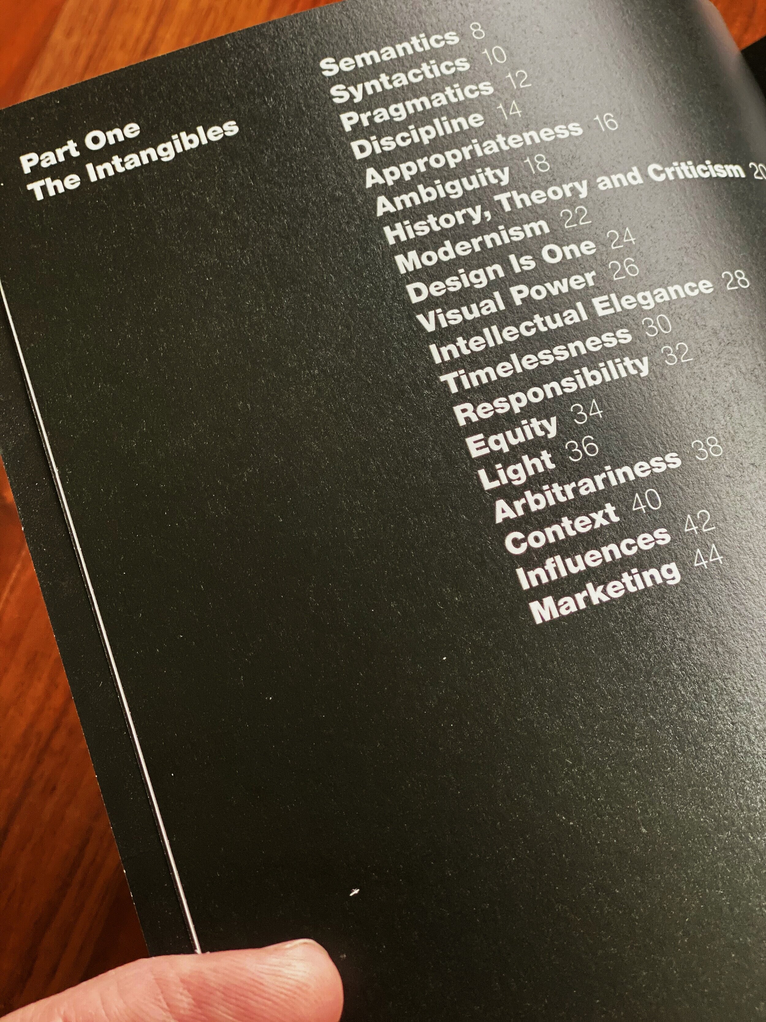
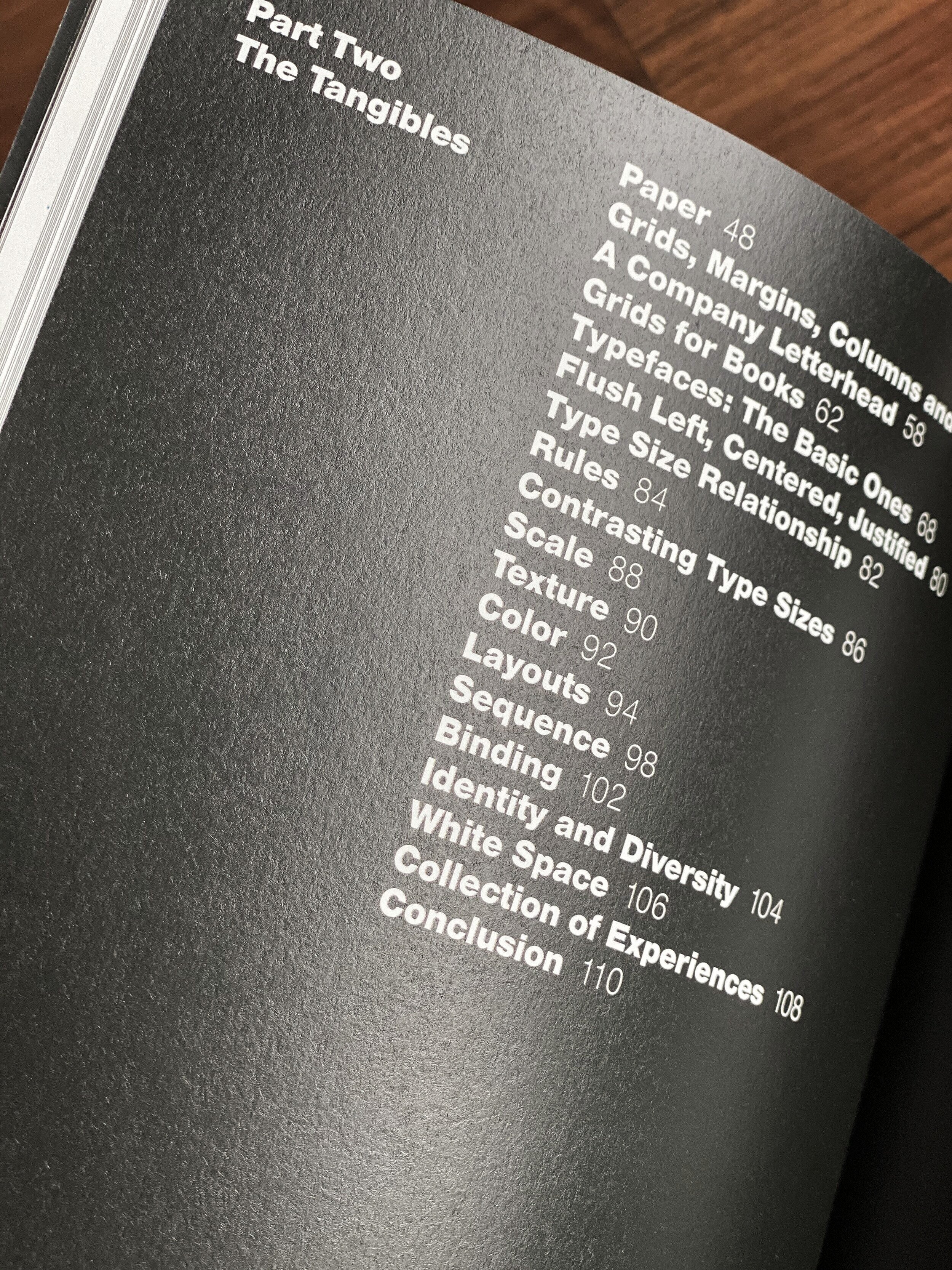
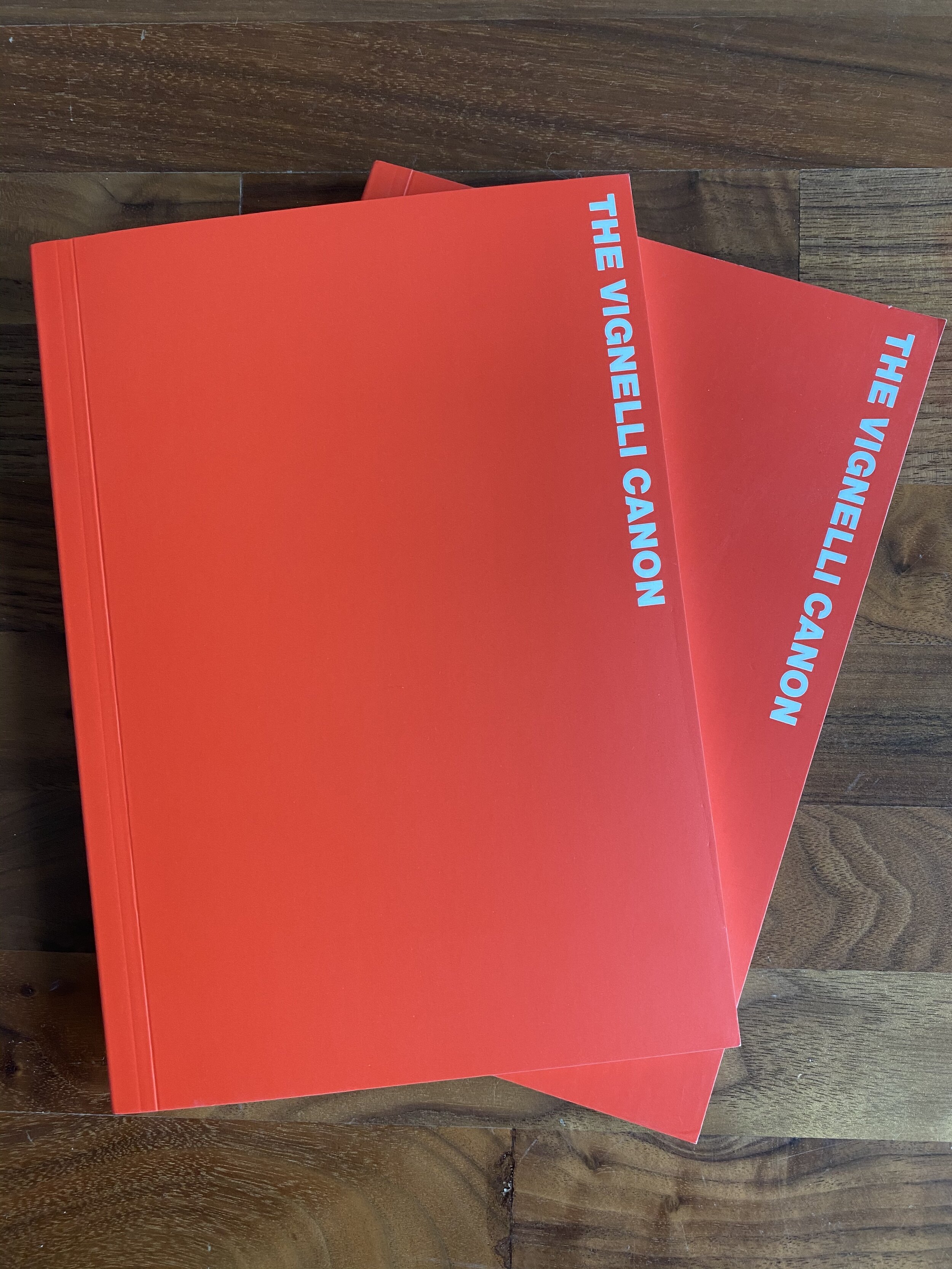
“The Vignelli Canon” by Massimo Vignelli.
Ok, you can download a PDF of this for free online, so it doesn’t entirely count…but I possess two copies at all times. One for myself, and another to give to someone I come across who would be enriched by it. This book is a must-have reference for those who seek a crash course to better understand graphic design and visual design. Simple, concise and elegant, The Vignelli Canon introduces key principles and approaches embodied in the Vignelli way, but more than that it contains crystalline gems of unapologetic design wisdom you can’t find anywhere else.
“There are no hierarchies when it comes to quality. Quality is there or is not there, and if is not there we have lost our time. (pg 16)” is an anthem that runs deep in every designer’s blood whether they can articulate it or not. This is just one of many countless treasures you will uncover.


“How To” by Michael Bierut
Keeping the momentum going with the Vignelli connection, this book by Michael Bierut (who got his start designing with the Vignelli’s) is not…as advertised…a “how to” at all. It is actually a personal and motivating journal by Bierut himself that elegantly guides you through decades of singularly brilliant and thoughtful design wins. As much as I’d love to steal the work for my self and “change the world” as Bierut suggests…you see quickly in the examples and in the narrative how each client was unique and each idea and idea so interwoven they could only be invoked once.
“Sketching User Experiences” by Bill Buxton
It ain’t pretty, I’m not gonna lie. But this is a masterpiece of writing, philosophy, provocation, craft and creative agency set forth by the great Bill Buxton.
I also keep two copies of this one - ready at the drop of a hat to gift it to a talented designer and change their life forever. Buxton has devoted many decades to a craft that many of us have never fully unpacked…that of creating experiences in a digital medium our physical brains and bodies can relate to. Sure, this is interaction design, but most of interaction design today is built on fundamentals so commonplace they feel like they were always there. Things like text that looks the same as text looks on a printed page (gracias, Bill Hill), things like a cursor that moves at perceptually the same scale as your hand on a mouse. They weren’t always there at all and Bill can tell you how they came to be and who did it, because he was there. Odds are he had something to do with it, too.
Sketching User Experiences isn’t…really….a process book, it’s not a tips and tricks book. It is the most densely populated source of truth, provocation and inspiration I have ever seen - told with light and with humor and playful wisdom throughout. Guaranteed to make you a better designer and a Bill Buxton fan like me.
“Simple and Usable” by Giles Colborne
It took more than a decade to have the confidence to truly believe anything about design. Now, as you can tell, I have a lot to say. It’s not because I’m an expert or because I invented all of my thoughts and now need to spread those thoughts like seeds of originality throughout the world. It is because I’ve seen certain patterns over and over and those patterns give me strength to believe, innovate and take the risk of creating with confidence. I have references, I have experiences, I have mentors, I have backup.
This book “Simple and Usable” has, in many ways, been a kind of backup for many of the beliefs and insights I’ve collected over the years. Many concepts and stories told in the book help me feel brave when I’m faced with insurmountable tradeoffs, but I know we aren’t “there yet” in making a product as Simple and Usable as it should be. I love the way Colborne breaks concepts like simplicity and usability down: One concept per page, and always with an example. Incredibly digestible, memorable and fortifying…this book is as Simple and Usable in itself as you could ever want your product to be.
My favorite “Naoto Fukasawa” book, because I know designer’s don’t actually read design books.
Ok, I know what you’re thinking. You’ve been very patient. I know none of you guys and gals actually read design books, and at least 3/4 of what you need in your daily diet of design is just pure, flippable, unadulterated eye candy that moves you so damn much you want to get up off your lazy but and make something.
That’s why I threw this in there. Because it is a well that never runs dry. It is the wind beneath our wings. It is the wordless poetry and grace of a cellphone designed to delight the hand….coupled, perhaps, by a sentence composed by the master himself: “No, the motif is a potato”
Why not be a design hero? make your own book.
One last recommendation. All of us have a story to tell, and designers have a unique ability to tell those stories. One practice I enjoy very much is documenting my design experiences. At the end of a long run of designing stuff, I touch up my sketches, gather my stories and photos and make a book. The process itself is cathartic and memory sharpening, good for the brain muscle, and the end result honors the work and the people I designed with in ways that I find continually rewarding every time I sit down with a coffee and thumb through it. I highly recommend you be your own design hero and give it a shot.
“Lytro Work” by…ME! There are lots of easy ways to put together a professional quality book via online vendors. My fave currently is blurb
This is a process book that catalogs the work we did for Lytro during my time at Artefact design. I love to look back on it now, as it captures a “lost era” for many of us who came together on this marvelous project, but have since scattered to the winds working for different companies. Also, occasionally there’s a story or an anecdote that comes up that I can make readily accessible.
Ben Collette (now at Valve), Lulu Mills (now at Smart Design) and Markus Wierzoch (now at Eli Lily) getting together for a morning coffee and brainstorm sketch session.
A way to remember the “paths not taken” that would otherwise be lost
Revisit the story behind the story.
Remember
I can imagine this long, long blog post has inspired a renewed desire to call up your local bookstore and reinvigorate your passion for design and self-enrichment by buying a bunch of books. I can imagine the time it took you to read all of this has made you hungry, but…Well…


