


Vale Intro
Vale Intro
i wanted form to follow function
The fact no one was asking for it was a frustrating fact of life for me during my early days of designing tech. In fact, the most successful tech products of the era were often best known for their distinct lack of form. An iPhone, for example is really just a screen - a box that can become a flashlight or a camera or whatever you want simply by tapping an icon. Designing tech felt more like ornamentation at times than it did like actual design. It was hard to accept the idea that form could do nothing for the product's function beyond "getting out of the way" and I was always looking for ways to establish functional form cues in tech products.
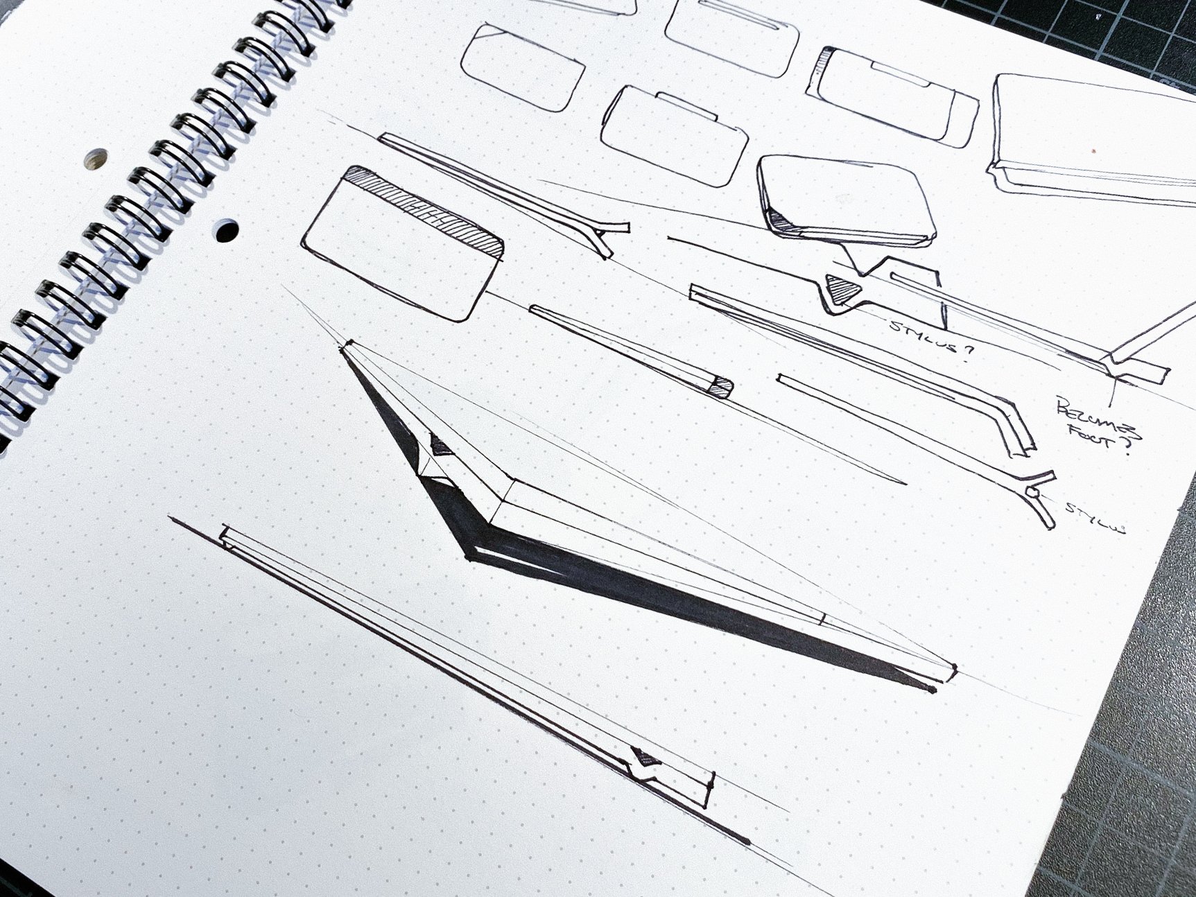
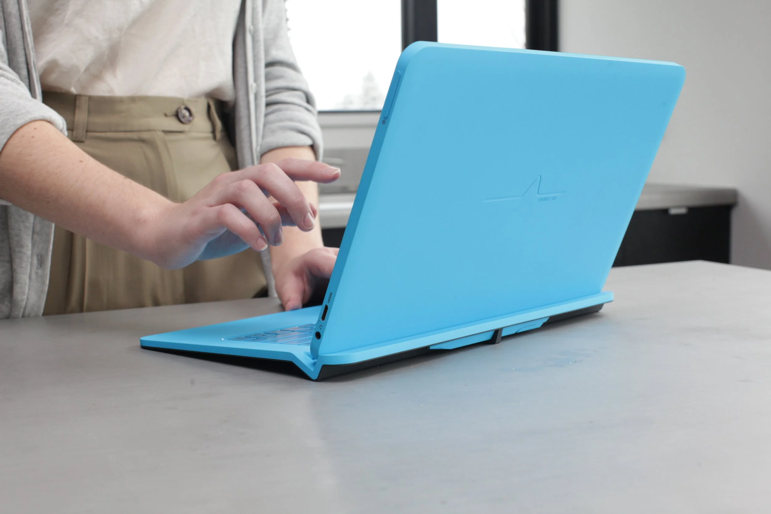
I feel like this concept demonstrates that the power of form is not entirely dead in tech products. Starting with the premise of "no hinge" the V-shaped valley (or Vale for short) serves as a foot - also as a nook for lifting the tablet off the magnetic base, and finally the precise angle inside holds the screen in just the right way for use with the keyboard. I wanted to offer a product that could be read by anyone, and reveal intuitively it's function and its purpose...just like how good design used to be before all of these monolithic rounded rectangles came along.
Vale Process
Vale Process
A hybrid without complications
Hybrids invariably test well in focus group testing, but when convertibles and detachables hit the shelves they rarely sell in any great numbers. It seems that people generally love the idea of a laptop and tablet in one, but when faced with the prospect of owning one, the story changes. The most common criticism of hybrids is that they are simply "too weird" and "too complicated" to comprehend. On the design side, the reaction has been to simplify the equation - to bias toward one direction or another and create a hybrid that feels as much like a laptop (or tablet) as possible. This approach makes sense, and we did it with some success in North Cape.
With Vale, I tried to take a different design approach. I wanted to explore the power of creating two stand-alone objects that…when combined…created a third (infinitely better) thing. It strives to create a product that boldly feels unique to any other laptop or tablet out there, and yet integrates the two modes beautifully.
uses space
uses space
THE RIGHT BALANCE
Most of the product's weight is in the lid. To avoid tipping over, the foot needed to be about 23mm from the back. Since we didn't have a hinge, we didn't need to grow the system to accomodate this - but we did have about 23mm of unused space behind the foot. A beautiful home for an active stylus.
Be yourself
Be yourself
lose nothing IN TRANSLATION
A lot of discussion was put into whether the base should greatly expand the capabilities (and also size and weight) of the Ultrabook when attached: should it offer more IO ports, double the battery life, boost the performance, provide a wi-fi boost? In the end, the right decision was a "what you see is what you get" approach. When you detach the keyboard and trackpad, that is precisely what you leave behind...the rest of the experience remains perfectly intact. I think this was a smart move. Instead of offloading performance to a detachable peice of the system, more effort was placed into packing that performance into the space behind the screen.